How to Build a Powerful and Production-Ready Tailwind Button

Tailwind is a library that encourage developers to split code into smaller, reusable components. This practice is good, and it helps manage the styling and the features of each piece of code.
Creating atoms such as buttons or typography is great. However, styling is only one part of the story. Every button isn’t the same, some are more important than others and need a specific style, others are larger, … That’s where logic needs to be added.
Sadly, I had a hard time finding good documentation online on this subject. Not many people wrote articles about building reusable components that support a range of props (size, variant, …) and while ensuring a good DX with type safety.
That’s why I want to remedy this by building a project template that would contain some prebuilt atoms. This could become an ongoing series as I go through the different atoms I might want to create in my future projects.
I know that some people aren’t really interested in the explanation. Here is the component that can be copied and pasted in your project.
If you want to, you can also star the repository on my GitHub, so you won’t miss any future update.
You can skip the end of the article
Why bother creating this project?
That’s a fair question. Why bother creating this project when I could have used Charka UI, Mantine or a solution closer to Tailwind such as Daisy UI?
Well, I want to experiment a bit in my free time. Some friends asked me to build small websites for a specific need they have. Nothing fancy, usually it’s 2-3 pages and helps them solve a small problem they have.
Having some side project and some projects of mine mean that I don’t want to spend too much time reinventing the wheel. That’s why building a boilerplate is the appropriate solution (at least for now).
The projects I built aren’t critical or need special care, this means that my current approach works fine. Building a versioned component library is something that could be done in the future, but seems a bit overkill for now.
Why Tailwind?
First question, why do I want to use a tailwind when I could have simply used Chakra UI (as I do at my current job)? I recently wrote an article about Tailwind and my first impression of the library. But here are the main reasons, I love the flexibility, the performances and the ease of use that Tailwind offers.
I also find that Tailwind is appropriate in my use case. Tailwind excels for building quick prototypes and for quickly having something online.
 Flavien Bonvin
Tailwind is also an excellent way to improve in CSS and overall HTML structure. Tailwind can be compared to a low-level language when it comes to styling libraries. It is not pure CSS, but it comes dangerously close.
Other component libraries offer a huge abstraction layer over some concepts. It has some application, but I want to hone in my development skills, and using Tailwind will help me in that sense.
I will definitely struggle to implement some components in the future. But that’s part of the process, and I’m sure that I’ll learn many things that I wouldn’t have otherwise. Finally, it’s a great source of content, I’ll be able to document my journey even tho I don’t have a proper direction for the project yet.
What is the end goal?
I realize that I’m basically saying «let’s build a component library» and that’s what I’m doing in a certain way. I do this in order to learn and simplify my future projects. The components I will implement will be added according to the needs I have in my projects.
The goal isn’t to recreate Daisy UI, but rather to create a set of code snippets that I can reuse when needed in my projects.
I won’t bother building everything myself. I used in the past some libraries such as Tailwind plugins or Headless UI to make my life easier. Not only that, but I don’t see much interest in building a custom modal when Headless UI offers an accessible and unstyled component.
This project aims to bridge the gap between components libraries and Tailwind. By building myself some atoms and reusable component, I can focus on implementing features. Besides, the logic is there, I simply have to adapt the design which is fairly simple with Tailwind.
I do this without a real goal in mind, and because it tickles my fancy.
Project stack
Since the project is starting, I’ll quickly explain the stack I used and the reason behind some of the choices.
TypeScript
This is non-negotiable for me. Regardless of the size of the project, it has become impossible for me to build something in JavaScript. Defining types can be a bit time-consuming, but it’s all worth it, in my opinion, and makes the developer’s life easier in the long term.
NextJS
It quickly imposed as my framework of choice. I have about 5 years of React experience, and I’ve been using NextJS for the past 2 years. The features NextJS offer is quite impressive and unique.
clsx
clsx is a very small library that helps compose classes. It’s easier to handle variants and props this way and is the library I decided to use (the other renown one is called classnames)
Prettier
prettier is by default on my projects, and I try to have the smallest configuration as possible. The library is opinionated, let’s try to stick to the opinions of its maker. I also use prettier for the prettier-plugin-tailwindcss that automatically order Tailwind classes. This way, all the classes are neatly organized, and it’s easier to find what we’re looking for.
Button Component
Enough discussion (future article will definitely have less text). Let’s discuss the button I plan to write. This will be my first component, I’m sure things will change, and the code will evolve as I get to know more of my tools.
Subscribe to the newsletter to get new articles right in your inbox!
Subscribe to the newsletterSome Requirements
Before discussing the code, there are some requirements my button must needs to meet to be production ready. Nothing fancy at first, the goal is to have a basic logic to be able to use the buttons in different scenarios.
First, the component should pass all the classic React props to the underlined button. For example, I shouldn’t have to define what the onClick method does. TypeScript surely offers some types for that, and I’ll be able to do just fine.
Secondly, it should always be possible to add some classes to the button without breaking the whole design of the button. There will be cases where the button will be in an absolute position or where the background color must change (for a login button for example). Being able to extend the established design is a must.
Thirdly, the button should support multiple sizes, variant and state from the beginning. No need to go overboard with those since it’s always possible to add a variant or a size depending on the design on the project I’m working on, but having 3 values of each should be pretty sufficient.
Lastly, I’m using Typescript. Everything should be the type to the best of my abilities. I’m not a Typescript guru, but I can make sure that the different props are correctly typed and will provide insightful IntelliSense.

Result
Here is a screenshot of the look I went for the buttons. Nothing fancy, is a very plain blue from Tailwind.
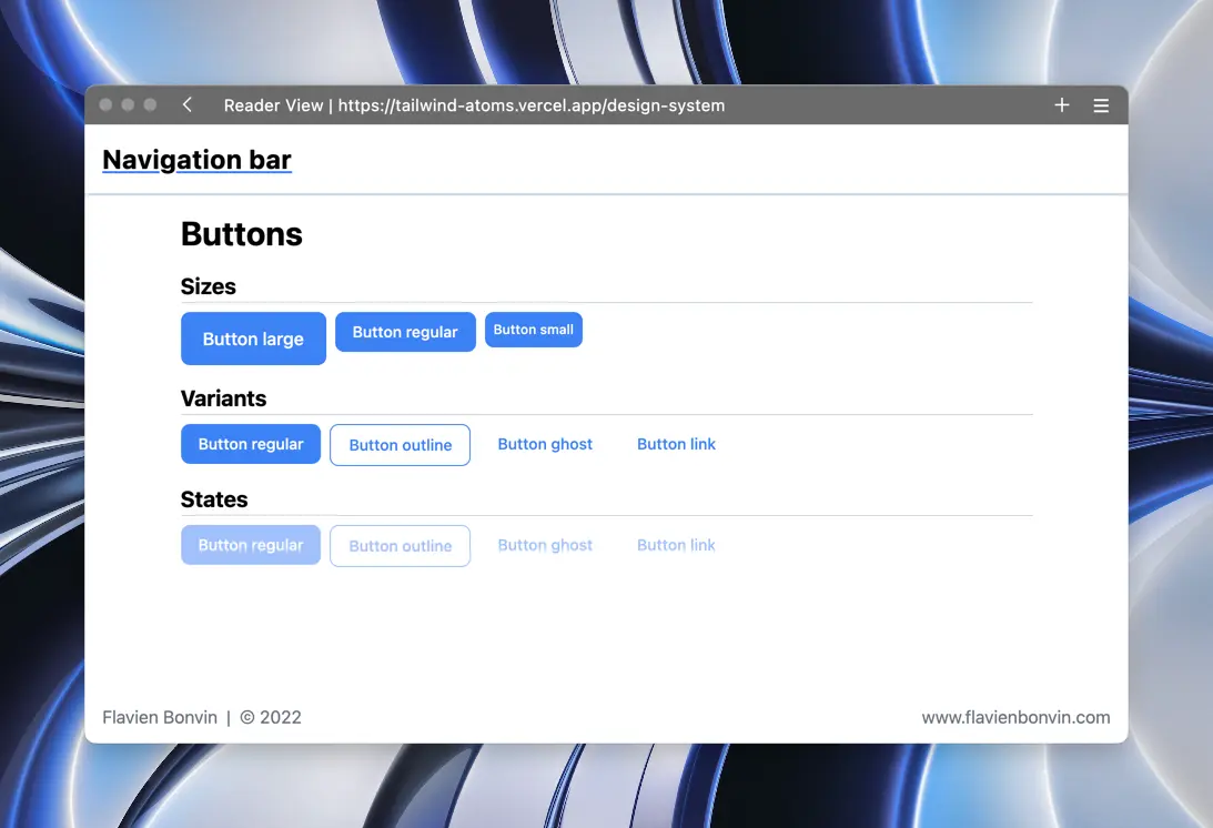
The goal of the atoms I’m building isn’t to make them as nice looking as possible, but rather to have a base that can be customized later on. Spending too much time on the design can be counterproductive, since the design will change depending on the project.
The full code is present below, but I’ll explain some part of it here. On top of that, I’ll share my Tailwind config, so you can have the exact same component as mine.
Props and typing
type buttonVariant = "regular" | "outline" | "ghost" | "link"
type buttonSize = "regular" | "large" | "small"

interface Props extends ButtonHTMLAttributes<HTMLButtonElement> {
  size?: buttonSize
  variant?: buttonVariant
  children: ReactNode
}
The created button only supports three props, the size which has 3 options, the variant which define the look of the button which has four values and children.
Note that the children is a ReactNode and not a simple string. This can be useful to add an icon in the button.
One of the requirements of the button was to be useable like a standard HTML button. This is achieved in the props by extending them of the ButtonHTMLAttributes<HTMLButtonElement>.
Extending standard React props is something I discovered only recently. I had a component that rendered an input and had to pass type, placeholder, onChange, value, … It was a pain and a waste of time since I was redefining all the props an input has.
A quick Google search helped me discover the possibilities of typescript, and I was able to delete most of the props of my components and have a better overall component.
Optional values
const Button = ({
  size = "regular",
  variant = "regular",
  children,
  className,
  ...props
}: Props) => {
Passing props is great, but it’s best to define default values for the most common one. This way defining a button is faster.
<Button size="regular">Button large</Button>
<Button>Button regular</Button>
Both buttons will be the same, except that I don’t have to add the size props in the second line. No need to define default props.
Class composition
<button
      className={clsx(
        "h-fit w-fit rounded-lg text-xs font-medium transition-all",
        "disabled:cursor-not-allowed disabled:opacity-50",
        className,
        size === "large" && "px-5 py-3 text-base",
        size === "regular" && "px-4 py-2 text-sm",
        size === "small" && "px-2 py-2",
        variant === "regular" &&
          "bg-brand text-white hover:bg-brand-dark disabled:hover:bg-brand",
I decided to use clsx to compose the classes of my components. It’s a small library and helps organize the code.
At some point I hesitated to extract the classes in separate objects, so I could have been able to do things such as
const sizesClass = {
  large: "px-5 py-3 text-base",
  small: "px-2 py-2",
  regular: "px-4 py-2 text-sm",
}

...

<button
      className={clsx(
            ...
            className,
            sizeClass[size]
Instead of defining the classes in the className props of the button, I would have been able to map an object.
This works fine, but I decided against it since the prettier plugin doesn’t detect those classes and won’t reorder them. Not a huge deal, but I’d rather have all my classes ordered the same as having to have to search for them.
No @apply
I see a lot of articles online where people make some styling using the @apply keyword in CSS files. I tried that for some time but decided to not go this route since it wasn’t possible to override styles of the component without breaking the whole design.
Furthermore, I want to be able to add a class to my button, this can be particularly helpful for placement. It’s a shame to add a div to the DOM simply to align something to the right. In my opinion, extending the classes I have on the button solves this issue.
Final Code
Here is my first atom, the humble button!
import { type ButtonHTMLAttributes, type ReactNode } from "react"
import clsx from "clsx"

type buttonVariant = "regular" | "outline" | "ghost" | "link"
type buttonSize = "regular" | "large" | "small"

interface Props extends ButtonHTMLAttributes<HTMLButtonElement> {
  size?: buttonSize
  variant?: buttonVariant
  children: ReactNode
}

const Button = ({
  size = "regular",
  variant = "regular",
  children,
  className,
  ...props
}: Props) => {
  return (
    <button
      className={clsx(
        "h-fit w-fit rounded-lg text-xs font-medium transition-all",
        "disabled:cursor-not-allowed disabled:opacity-50",
        size === "large" && "px-5 py-3 text-base",
        size === "regular" && "px-4 py-2 text-sm",
        size === "small" && "px-2 py-2",
        variant === "regular" &&
          "bg-brand text-white hover:bg-brand-dark disabled:hover:bg-brand",
        variant === "outline" &&
          "border border-brand text-brand hover:border-brand-dark hover:bg-brand-light disabled:border-brand disabled:bg-transparent",
        variant === "ghost" &&
          "text-brand hover:bg-brand-light disabled:hover:bg-transparent",
        variant === "link" && "text-brand hover:underline disabled:no-underline"
      )}
      {...props}>
      {children}
    </button>
  )
}

export default Button
My current tailwind config at the time of writing this article
/** @type {import('tailwindcss').Config} */
const colors = require("tailwindcss/colors")

module.exports = {
  content: [
    "./pages/**/*.{js,ts,jsx,tsx}",
    "./components/**/*.{js,ts,jsx,tsx}",
  ],
  theme: {
    extend: {
      colors: {
        brand: {
          light: colors.blue[100],
          DEFAULT: colors.blue[500],
          dark: colors.blue[700],
        },
      },
    },
  },
  plugins: [],
}